Learn Unpic
ascorbic/unpic-imgWhat is unpic-img?
unpic-img is a component library for easily displaying high-performance,
responsive images on the web and includes support for ten different web
frameworks. It is designed to be as easy to use as a basic <img> tag, but this
guide will help you get the most out of it, and explain more advanced features
such as art direction.
These examples are all editable. They use JSX, but the concepts are the same for all frameworks. See the individual framework pages for examples.
    <Image
      src="https://cdn.shopify.com/static/sample-images/bath.jpeg"
      width={400}
      height={300}
      alt="A lovely bath"
    />
Try inspecting the HTML for the image above. You will see that it generates a
fully responsive image with the correct aspect ratio, and the correct srcset.
What it does
When you pass the component an image URL, it automatically detects the CDN or CMS, and then uses that host’s own API to generate the correct sources. You don’t need to worry about installing any extra packages or configuring anything. It uses unpic lib, which supports dozens of different hosts, including Cloudinary, Imgix, Sanity, Contentful, Shopify and more.
As well as generating the correct sources, it also generates styles to ensure the image is responsive and has the correct aspect ratio. This avoids layout shift, and gets you the best performance (and Core Web Vitals scores) possible.
This is the HTML that is generated for the example above:
<img alt="A lovely bath" loading="lazy" decoding="async" sizes="(min-width: 400px) 400px, 100vw" style="object-fit: cover; max-width: 400px; max-height: 300px; aspect-ratio: 1.33333 / 1; width: 100%;" srcset=" https://cdn.shopify.com/static/sample-images/bath.jpeg?width=400&height=300 400w, https://cdn.shopify.com/static/sample-images/bath.jpeg?width=640&height=480 640w, https://cdn.shopify.com/static/sample-images/bath.jpeg?width=750&height=563 750w, https://cdn.shopify.com/static/sample-images/bath.jpeg?width=800&height=600 800w " src="https://cdn.shopify.com/static/sample-images/bath.jpeg?width=400&height=300"/>You can see that it has converted the src URL to generate multiple sources
with different sizes. It can do this because Unpic recognizes it as a Shopify
URL and knows how to manipulate it. For the next few examples we’ll be using
Unsplash, which it recognises as an Imgix URL.
Layouts
Unpic supports three different layouts which cover most use cases. When you
choose a layout it affects the way the image is sized and scaled. It
automatically generates the correct CSS for this, as well as the right sizes
and srcset attributes.
The layouts in the video are, from top to bottom: fullWidth, constrained and
fixed. The default is constrained, which sets a maximum size for the image,
but scales it down to fit smaller screens. The fullWidth layout will stretch
to the width of the screen, and is best for hero images and banners. Fixed
images don’t scale at all, and are best for logos and icons.
<>
    <Image
        src="https://images.unsplash.com/photo-1522303099041-44f71373af66"
        layout="fullWidth"
        height={200}
        priority
        background="auto"
        alt="Full width"
    />
    <Image
        src="https://images.unsplash.com/photo-1522303099041-44f71373af66"
        layout="constrained"
        width={400}
        height={200}
        alt="Constrained"
    />
    <Image
        src="https://images.unsplash.com/photo-1522303099041-44f71373af66"
        layout="fixed"
        width={200}
        height={200}
        alt="Fixed"
    />
</>
Photo by Casey Horner on Unsplash
Use the handle in the bottom right to resize the container to see the different
way they resize. Note that normally you should not use fullWidth in a case
like this where the image is inside a container. It should only be used where
the image can be resized to the full width of the screen.
Priority and lazy loading
You may have spotted the priority prop in the example above. By default, the
generated images use lazy loading and asynchronous decoding. This is best
practice for most images because it avoids needing to download too much
immediately. However the largest image above the fold should be loaded with
priority set. This makes it use eager loading, and keeps the largest
contentful paint time at a minimum.
Try editing the code below to remove priority and inspect the HTML to see the
difference.
    <Image
        src="https://images.unsplash.com/photo-1654099749558-84ac187eb292"
        width={400}
        height={300}
        priority
    />
Photo by Karthik Sreenivas on Unsplash
Image backgrounds
When an image is loading it is good to show a background color or placeholder,
particularly if it is large. This can prevent long LCP times, and generally
makes loading feel faster. You can use the background prop to set a color or
image as the background. It accepts image URLs, colors, gradients and CSS. The
simplest value to set is “auto”, which adds the URL for a tiny version of the
main image.
    <Image
        src="https://images.unsplash.com/photo-1654099749558-84ac187eb292"
        width={400}
        height={300}
        background="auto"
    />
This is not ideal, because it requires a network request, but it is better than
nothing for large images. A better option is to calculate the dominant color of
the image and use that as the background or use a data URI. Some CMSs will
provide this as part of the image object, which makes it easy. This example uses
the Sanity image object. Try editing
the example to use sanityImage.metadata.palette.dominant.background instead.
<Image
    src={sanityImage.url}
    width={400}
    height={300}
    background={sanityImage.metadata.lqip}
/>
On Astro, the service can auto-generate these placeholders for you. See the docs
for @unpic/astro for more details.
For other frameworks, the @unpic/placeholder package has lots
of tools that can help generate backgrounds, including helpers to calculate the
values yourself at build time, or render blurhash placeholders using CSS.
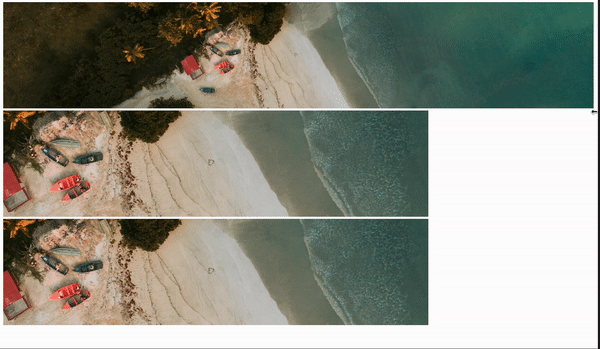
Art direction
While normally you just want to change the size of an image for smaller screens,
sometimes you want to get more creative. A beautiful panoramic shot might be
best for a high resolution desktop, but a tight portrait or square crop might be
better on a phone. Sometimes you might want to use an entirely different image.
For this you can use a <picture> tag alongside the Unpic <Source> component.
Art direction with a <picture> tag lets you do this, with different sources
selected using media queries. Let’s look at an example.
This dramatic lighthouse shot would be a great hero image, and can be shown in massive resolution on desktop
    <Image
        src="https://images.unsplash.com/photo-1654099749558-84ac187eb292"
        height={300}
        layout="fullWidth"
    />
Here’s another image of the same lighthouse, but a closer cropped portrait view. This would work better on mobile.
    <Image
        src="https://images.unsplash.com/photo-1601962468178-9f84128bd046"
        height={400}
        width={300}
        layout="constrained"
    />
By using a <picture> tag and source component we can display this image on
mobile, while keeping the hero image for larger screens.
<picture className="hero">
  {/* Hero image, displayed on screens 768px or wider */}
  <Source
    src="https://images.unsplash.com/photo-1654099749558-84ac187eb292"
    media="(min-width: 768px)"
    layout="fullWidth"
  />
  {/* Portrait image for screens below that size */}
  <Source
    src="https://images.unsplash.com/photo-1601962468178-9f84128bd046"
    media="(max-width: 767px)"
    width={600}
    height={800}
  />
  {/* Fallback image, also used for shared alt and loading props */}
  <Image
    src="https://images.unsplash.com/photo-1654099749558-84ac187eb292"
    layout="fullWidth"
    alt="Lighthouse"
    priority
    unstyled
  />
</picture>
Did you just try to resize the container to see if it works? It doesn’t because the media query targets the window width, not the container. Unfortunately container queries don’t work with images. Try resizing the whole window and you’ll see it change.
We’ve added the unstyled prop to the Image because otherwise the inline
styles will override our responsive styling. A normal Unpic <Image> component
would handle all the styling for you, but we had to use unstyled here because
we can’t use responsive breakpoint with inline styles. Instead we’ll be adding
CSS to do the styling. We can’t do this in the playground component I’m using
here, but I’ve applied the styles below:
/* Style for all layouts */.hero img {  object-fit: cover;  width: 100%;}
@media (min-width: 768px) {  /* Optionally add styles you want for full width here, e.g. max-height */}
@media (max-width: 767px) {  /* Style for constrained layout */  .hero img {    max-width: 600px;    aspect-ratio: 3/4;  }}
This gives a full width hero image for large screens which uses the image’s
intrinsic size to set the aspect ratio, and smaller screens get a portrait image
that keeps the 3:4 (i.e. 600x800) aspect ratio, while being constrained to 600px
wide. You can use as many Source images and breakpoints as you need to work
with your design.
Dark mode
While the <source> media attributes only supports a subset of media queries,
it covers most of the ones you might need. Another interesting option is
prefers-color-scheme, which lets you have different images for light and dark
mode. This offers some creative possibilities. Here’s another photo of the
lighthouse, this time a night shot.
    <Image
        src="https://images.unsplash.com/photo-1522303099041-44f71373af66"
        width={600}
        height={400}
        alt="Lighthouse at night"
        layout="constrained"
    />
We can create a picture tag which switches the image according to the current color scheme.
<picture>
  {/* Daytime, for light mode */}
  <Source
    src="https://images.unsplash.com/photo-1654099749558-84ac187eb292"
    media="(prefers-color-scheme: light)"
    width={600}
    height={400}
  />
  {/* Nighttime, for dark mode */}
  <Source
    src="https://images.unsplash.com/photo-1522303099041-44f71373af66"
    media="(prefers-color-scheme: dark)"
    width={600}
    height={400}
  />
  {/* Always include the <Image> last */}
  <Image
    src="https://images.unsplash.com/photo-1654099749558-84ac187eb292"
    width={600}
    height={400}
    alt="Lighthouse"
  />
</picture>
We can use the automatic styling here, because the layouts and sizes are all the same. Try changing your device’s color scheme to see it change. Note: the toggle on this page won’t do the trick, because it doesn’t actually change the color preference - you need to change your actual device setting. Here’s what it looks like:
This is the HTML that is generated.
<picture ><source sizes="(min-width: 600px) 600px, 100vw" srcset=" https://images.unsplash.com/photo-1654099749558-84ac187eb292?w=600&h=400&fit=min&auto=format 600w, https://images.unsplash.com/photo-1654099749558-84ac187eb292?w=640&h=427&fit=min&auto=format 640w, https://images.unsplash.com/photo-1654099749558-84ac187eb292?w=750&h=500&fit=min&auto=format 750w, https://images.unsplash.com/photo-1654099749558-84ac187eb292?w=828&h=552&fit=min&auto=format 828w, https://images.unsplash.com/photo-1654099749558-84ac187eb292?w=960&h=640&fit=min&auto=format 960w, https://images.unsplash.com/photo-1654099749558-84ac187eb292?w=1080&h=720&fit=min&auto=format 1080w, https://images.unsplash.com/photo-1654099749558-84ac187eb292?w=1200&h=800&fit=min&auto=format 1200w " media="(prefers-color-scheme: light)" /> <source sizes="(min-width: 600px) 600px, 100vw" srcset=" https://images.unsplash.com/photo-1522303099041-44f71373af66?w=600&h=400&fit=min&auto=format 600w, https://images.unsplash.com/photo-1522303099041-44f71373af66?w=640&h=427&fit=min&auto=format 640w, https://images.unsplash.com/photo-1522303099041-44f71373af66?w=750&h=500&fit=min&auto=format 750w, https://images.unsplash.com/photo-1522303099041-44f71373af66?w=828&h=552&fit=min&auto=format 828w, https://images.unsplash.com/photo-1522303099041-44f71373af66?w=960&h=640&fit=min&auto=format 960w, https://images.unsplash.com/photo-1522303099041-44f71373af66?w=1080&h=720&fit=min&auto=format 1080w, https://images.unsplash.com/photo-1522303099041-44f71373af66?w=1200&h=800&fit=min&auto=format 1200w " media="(prefers-color-scheme: dark)" /> <img alt="Lighthouse" loading="lazy" decoding="async" sizes="(min-width: 600px) 600px, 100vw" style="object-fit: cover; max-width: 600px; max-height: 400px; aspect-ratio: 1.5 / 1; width: 100%;" srcset=" https://images.unsplash.com/photo-1654099749558-84ac187eb292?w=600&h=400&fit=min&auto=format 600w, https://images.unsplash.com/photo-1654099749558-84ac187eb292?w=640&h=427&fit=min&auto=format 640w, https://images.unsplash.com/photo-1654099749558-84ac187eb292?w=750&h=500&fit=min&auto=format 750w, https://images.unsplash.com/photo-1654099749558-84ac187eb292?w=828&h=552&fit=min&auto=format 828w, https://images.unsplash.com/photo-1654099749558-84ac187eb292?w=960&h=640&fit=min&auto=format 960w, https://images.unsplash.com/photo-1654099749558-84ac187eb292?w=1080&h=720&fit=min&auto=format 1080w, https://images.unsplash.com/photo-1654099749558-84ac187eb292?w=1200&h=800&fit=min&auto=format 1200w " src="https://images.unsplash.com/photo-1654099749558-84ac187eb292?w=600&h=400&fit=min&auto=format"/></picture>Formats
All current browsers support modern image formats such as WebP and AVIF, which
can offer much better quality and compression than old formats like JPEG and
PNG. Most image CDNs support content negotiation, which means they will deliver
the best format supported by the browser. This is handled automatically by
Unpic, so normally you don’t need to worry about it. Just put in your image URL
and the user will be served AVIF, WebP or JPEG according to their browser.
However not all image CDNs can do this. In these cases you need to specify the
generated format, which means you need to use a <picture> tag if you want to
deliver the best images to your users. Probably the most prominent example of a
CDN that does this is Contentful. We can use this method to deliver AVIF, WebP
or JPEG even though it doesn’t support content negotiation. In this example
we’ve passed in a Contentful image URL as a variable as it’s the same for each.
<picture>
  <Source src={imageUrl} type="image/avif" width={400} height={300} />
  <Source src={imageUrl} type="image/webp" width={400} height={300} />
  <Image src={imageUrl} width={400} height={300} alt="Toy" />
</picture>
This time you set type instead of media. This is the mimetype of the image,
which tell the browser which image to request. Although we pass in the the same
src for each, Unpic will automatically transform the URL to request the
correct format. See below for the generated HTML. If you scroll all the way to
the right you can see that the URLs include the fm parameter, which is how
Contentful specifies the format. Unpic handles this automatically for all
supported image CDNs.
<picture> <source sizes="(min-width: 800px) 800px, 100vw" srcset=" https://images.ctfassets.net/yadj1kx9rmg0/wtrHxeu3zEoEce2MokCSi/cf6f68efdcf625fdc060607df0f3baef/quwowooybuqbl6ntboz3.jpg?w=640&h=480&fm=avif&fit=fill 640w, https://images.ctfassets.net/yadj1kx9rmg0/wtrHxeu3zEoEce2MokCSi/cf6f68efdcf625fdc060607df0f3baef/quwowooybuqbl6ntboz3.jpg?w=750&h=563&fm=avif&fit=fill 750w, https://images.ctfassets.net/yadj1kx9rmg0/wtrHxeu3zEoEce2MokCSi/cf6f68efdcf625fdc060607df0f3baef/quwowooybuqbl6ntboz3.jpg?w=800&h=600&fm=avif&fit=fill 800w, https://images.ctfassets.net/yadj1kx9rmg0/wtrHxeu3zEoEce2MokCSi/cf6f68efdcf625fdc060607df0f3baef/quwowooybuqbl6ntboz3.jpg?w=828&h=621&fm=avif&fit=fill 828w, https://images.ctfassets.net/yadj1kx9rmg0/wtrHxeu3zEoEce2MokCSi/cf6f68efdcf625fdc060607df0f3baef/quwowooybuqbl6ntboz3.jpg?w=960&h=720&fm=avif&fit=fill 960w, https://images.ctfassets.net/yadj1kx9rmg0/wtrHxeu3zEoEce2MokCSi/cf6f68efdcf625fdc060607df0f3baef/quwowooybuqbl6ntboz3.jpg?w=1080&h=810&fm=avif&fit=fill 1080w, https://images.ctfassets.net/yadj1kx9rmg0/wtrHxeu3zEoEce2MokCSi/cf6f68efdcf625fdc060607df0f3baef/quwowooybuqbl6ntboz3.jpg?w=1280&h=960&fm=avif&fit=fill 1280w, https://images.ctfassets.net/yadj1kx9rmg0/wtrHxeu3zEoEce2MokCSi/cf6f68efdcf625fdc060607df0f3baef/quwowooybuqbl6ntboz3.jpg?w=1600&h=1200&fm=avif&fit=fill 1600w " type="image/avif" /> <source sizes="(min-width: 800px) 800px, 100vw" srcset=" https://images.ctfassets.net/yadj1kx9rmg0/wtrHxeu3zEoEce2MokCSi/cf6f68efdcf625fdc060607df0f3baef/quwowooybuqbl6ntboz3.jpg?w=640&h=480&fm=webp&fit=fill 640w, https://images.ctfassets.net/yadj1kx9rmg0/wtrHxeu3zEoEce2MokCSi/cf6f68efdcf625fdc060607df0f3baef/quwowooybuqbl6ntboz3.jpg?w=750&h=563&fm=webp&fit=fill 750w, https://images.ctfassets.net/yadj1kx9rmg0/wtrHxeu3zEoEce2MokCSi/cf6f68efdcf625fdc060607df0f3baef/quwowooybuqbl6ntboz3.jpg?w=800&h=600&fm=webp&fit=fill 800w, https://images.ctfassets.net/yadj1kx9rmg0/wtrHxeu3zEoEce2MokCSi/cf6f68efdcf625fdc060607df0f3baef/quwowooybuqbl6ntboz3.jpg?w=828&h=621&fm=webp&fit=fill 828w, https://images.ctfassets.net/yadj1kx9rmg0/wtrHxeu3zEoEce2MokCSi/cf6f68efdcf625fdc060607df0f3baef/quwowooybuqbl6ntboz3.jpg?w=960&h=720&fm=webp&fit=fill 960w, https://images.ctfassets.net/yadj1kx9rmg0/wtrHxeu3zEoEce2MokCSi/cf6f68efdcf625fdc060607df0f3baef/quwowooybuqbl6ntboz3.jpg?w=1080&h=810&fm=webp&fit=fill 1080w, https://images.ctfassets.net/yadj1kx9rmg0/wtrHxeu3zEoEce2MokCSi/cf6f68efdcf625fdc060607df0f3baef/quwowooybuqbl6ntboz3.jpg?w=1280&h=960&fm=webp&fit=fill 1280w, https://images.ctfassets.net/yadj1kx9rmg0/wtrHxeu3zEoEce2MokCSi/cf6f68efdcf625fdc060607df0f3baef/quwowooybuqbl6ntboz3.jpg?w=1600&h=1200&fm=webp&fit=fill 1600w " type="image/webp" /> <img alt="Toy" loading="lazy" decoding="async" sizes="(min-width: 800px) 800px, 100vw" style="object-fit:cover;max-width:800px;max-height:600px;aspect-ratio:1.3333333333333333;width:100%" srcset=" https://images.ctfassets.net/yadj1kx9rmg0/wtrHxeu3zEoEce2MokCSi/cf6f68efdcf625fdc060607df0f3baef/quwowooybuqbl6ntboz3.jpg?w=640&h=480&fit=fill 640w, https://images.ctfassets.net/yadj1kx9rmg0/wtrHxeu3zEoEce2MokCSi/cf6f68efdcf625fdc060607df0f3baef/quwowooybuqbl6ntboz3.jpg?w=750&h=563&fit=fill 750w, https://images.ctfassets.net/yadj1kx9rmg0/wtrHxeu3zEoEce2MokCSi/cf6f68efdcf625fdc060607df0f3baef/quwowooybuqbl6ntboz3.jpg?w=800&h=600&fit=fill 800w, https://images.ctfassets.net/yadj1kx9rmg0/wtrHxeu3zEoEce2MokCSi/cf6f68efdcf625fdc060607df0f3baef/quwowooybuqbl6ntboz3.jpg?w=828&h=621&fit=fill 828w, https://images.ctfassets.net/yadj1kx9rmg0/wtrHxeu3zEoEce2MokCSi/cf6f68efdcf625fdc060607df0f3baef/quwowooybuqbl6ntboz3.jpg?w=960&h=720&fit=fill 960w, https://images.ctfassets.net/yadj1kx9rmg0/wtrHxeu3zEoEce2MokCSi/cf6f68efdcf625fdc060607df0f3baef/quwowooybuqbl6ntboz3.jpg?w=1080&h=810&fit=fill 1080w, https://images.ctfassets.net/yadj1kx9rmg0/wtrHxeu3zEoEce2MokCSi/cf6f68efdcf625fdc060607df0f3baef/quwowooybuqbl6ntboz3.jpg?w=1280&h=960&fit=fill 1280w, https://images.ctfassets.net/yadj1kx9rmg0/wtrHxeu3zEoEce2MokCSi/cf6f68efdcf625fdc060607df0f3baef/quwowooybuqbl6ntboz3.jpg?w=1600&h=1200&fit=fill 1600w " src="https://images.ctfassets.net/yadj1kx9rmg0/wtrHxeu3zEoEce2MokCSi/cf6f68efdcf625fdc060607df0f3baef/quwowooybuqbl6ntboz3.jpg?w=800&h=600&fit=fill" /></picture>Remember: you don’t need this for most hosts, just for ones that don’t support content negotiation.
Frameworks
These examples all used JSX, but the props are the same for almost all frameworks. See the individual framework pages in the sidebar for more details.