@unpic/react
ascorbic/unpic-imgA high-performance, responsive image components for
React and Next.js. Generates a
responsive <img> tag that follows best practices, with the correct srcset,
sizes and styles. Detects image URLs from most image CDNs and CMSs and can
resize images with no build step.
Installation
Install the package from npm:
npm install @unpic/reactImport it into your component:
import { Image } from "@unpic/react";Usage
💡 These examples are all editable
    <Image
      src="https://cdn.shopify.com/static/sample-images/bath.jpeg"
      layout="constrained"
      width={400}
      height={300}
      alt="A lovely bath"
    />
Unpic for Next.js
If you are using Next.js, you can use the @unpic/react/nextjs component. This
works the same as the main @unpic/react component, but also supports the
Next.js Image Optimizer for images that don’t use a supported CDN. This includes
local images, either using a path or an import.
Usage
The component is part of the @unpic/react package, so you install it in the
same way:
npm install @unpic/reactThen, in your Next.js project, import the component from @unpic/react/nextjs:
import { Image } from "@unpic/react/nextjs";import logo from "../public/logo.png";
// You can use both local images, and ones from image CDNs<Image src={logo} alt="Logo" layout="constrained" />
<Image  src="https://cdn.shopify.com/static/sample-images/garnished.jpeg"  layout="constrained"  width={800}  height={600}  alt="Shopify product"/>
⚠️ For versions of Next.js before 13.5, import from
@unpic/react/next-legacy, not@unpic/react/nextjs
Differences from next/image
The @unpic/react/next component is similar in concept to next/image, and can
use the same image optimizer. However, it has a number of differences that may
mean you prefer to use it instead.
When unpic-img detects that you are using a supported CDN it will load the images from there directly, using the CDN’s own image resizing rather than Next.js. This saves the need to process the image twice, and means that you can use the more powerful features of the image CDN.
Unlike next/image, unpic-img will not distort the image to fit the requested
size as it uses object-fit: cover by default, and if using a supported CDN it
will crop the image to the requested aspect ratio.
There is no need to specify a loader, because unpic-img will automatically detect the CDN and use the correct loader, and supports many more than Next.js.
unpic-img includes three built-in layout modes: fixed, constrained, and
fullWidth. These affect how the image resizes, but also allows smarter
generation of the srcset and sizes attributes. See below for an example:
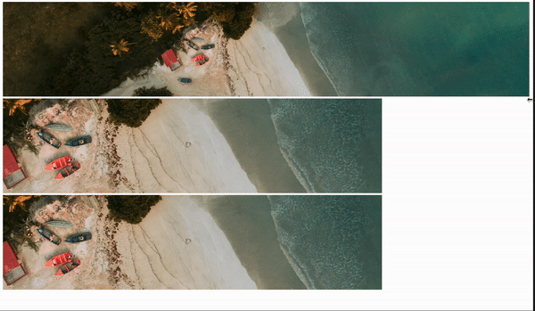
Image Props
The component accepts all the props of an <img> tag, plus the following:
layout
The resizing behaviour of the image.
constrained: (default) the image will be rendered at a maximum ofwidthandheight, but will scale down automatically if the container is smaller, maintaining the aspect ratio.fullWidth: the image will be rendered at full width of its container. This is optimized for full-width hero images. You can setheightto a fixed value, which will mean the image will be rendered at that fixed height and scale horizontally to fill the container.fixed: the image will be rendered at the exact size specified bywidthandheight
priority
By default, images are loaded lazily. If priority is set to true, the image
will be loaded eagerly, and will be given high priority by the browser. This is
useful for images that are above the fold, particularly large ones such as hero
images.
background
Either an image URL, CSS gradient or CSS colour value. If set to auto, a
low-resolution version of the image will be rendered as a background image, with
a blurred placeholder effect. This is still loaded from the remote server, so if
you can instead provide an inline base64-encoded version of the image or
background colour, you should do that instead. Look at
@unpic/placeholder for a library that can generate these
placeholders.
Bear in mind that this is not removed after the image loads, so it will be visible if the image has transparency.
aspectRatio
Instead of specifying both width and height, you can specify an
aspectRatio.
fallback
By default the CDN is auto-detected from the src URL, and if it can’t be
detected then it will use the source URL without transformation. You can specify
a fallback provider here instead, and all images will use this provider if the
CDN can’t be detected. This is useful if you are using a platform that provides
its own image CDN, or if you are using a provider that can transform remote
images.
See the the list of providers for supported values.
operations
This allows you to pass type-safe, provider-specific operations that will be performed on any images that use that provider. You can pass options for multiple providers if the images could come from different sources, and it will automatically apply the correct operations to each image, according to the detected provider.
In this example, we want the image to be flipped horizontally. The imgix and
bunny providers both support this operation but with different names, so we
can pass both options and they will be applied to the image as required.
{ imgix: { flip: "h" }, bunny: { flop: true } }}The supported operations are specific to each provider, and are type-checked and should provide autocompletion in your editor. See the the provider docs for the list of providers and their supported operations.
options
This allows you to pass provider-specific options that will be used for any images that use that provider. These options are used to configure the provider, including account IDs, domains and other settings. You can pass options for multiple providers if the images could come from different sources, and it will automatically apply the correct options to each image, according to the detected provider. These do not need to be provided if all images have options set in the URLs themselves.
{ cloudinary: { cloudName: "demo" }, ipx: { baseUrl: "/_images" } }}The supported configuration options are specific to each provider, and are type-checked and should provide autocompletion in your editor. See the the provider docs for the list of providers and their supported options.
breakpoints
By default the image breakpoints used in the srcset are generated based on the
layout and image size. You can override this by specifying an array of
breakpoints. The breakpoints are specified as an array of numbers, representing
the width of the image in pixels.
[320, 640, 960, 1280];Other props
Any prop supported by <img> tags can be passed in, except srcset which is
generated from src. The following props are set automatically, but can be
overridden if you need to:
sizesroledecodingloadingfetchpriority
Source Props
The Source component must be wrapped in a <picture> tag, and accepts the
following props:
media
A media query string. If this matches, the source will be used. Normally this
would be something like (min-width: 768px), but it can also be used for dark
mode detection, e.g. (prefers-color-scheme: dark) or other media queries.
type
The MIME type of the image. This is used to generate the type attribute of the
<source> tag, but is also passed to the CDN to generate the correct image
type. Normally an image CDN will auto-detect the required image format, but not
all support it and in that case you can use this component with type to
specify multiple image format options and the browser will choose the best
supported one.
Other props
It also accepts the following props that are used in the same way as in the Image component:
layoutsrcwidthheightaspectRatiocdnbreakpoints