
Level-up your web images with Unpic picture tags
Fri Oct 06 2023
Responsive images are among the most important tools for improving the
performance and user experience of a site. At its most basic, this means helping
the browser load images with different resolutions according to the device’s
window size, and fluidly resizing the image to fit. This is done by including a
srcset and sizes in your image tags, and using CSS for responsive resizing.
The Unpic <Image> component is the easiest way to do
this. It works automatically with your CMS, e-commerce provider or image CDN to
deliver the right size and format for the device and has support for ten
different frontend frameworks, including React, Astro, Svelte and Vue. However
until now it has only supported this core use case. Now, I have added support
for <picture> tags, which unlocks many powerful new features including art
direction and even loading different images in dark mode.
Art direction
While normally you just want to change the size of an image for smaller screens, sometimes you want to get more creative. A beautiful panoramic shot might be best for a high resolution desktop, but a tight portrait or square crop might be better on a phone. Sometimes you might want to use an entirely different image. Art direction with a picture tag lets you do this, with different sources selected using media queries. Let’s look at an example.
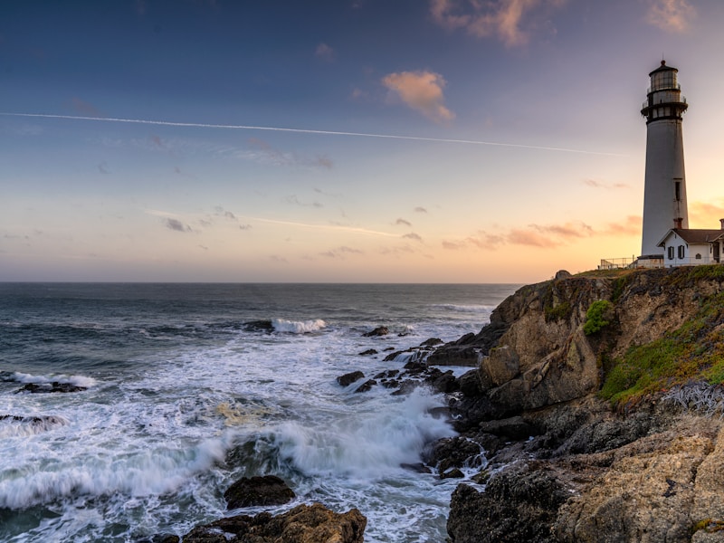
This dramatic lighthouse shot would be a great hero image, and can be shown in massive resolution on desktop
_Photo by
Unsplash
_
Unsplash is a supported image CDN, so embedding it is super easy with Unpic. The example here is Astro, but it’s similar in all supported frameworks.
<Image src="https://images.unsplash.com/photo-1654099749558-84ac187eb292" layout="fullWidth" alt="Lighthouse"/>The Unpic <Image> component generates the following html:
<img alt="Lighthouse" loading="eager" fetchpriority="high" style="object-fit:cover;width:100%" srcset=" https://images.unsplash.com/photo-1654099749558-84ac187eb292?w=640&fit=min&auto=format 640w, https://images.unsplash.com/photo-1654099749558-84ac187eb292?w=750&fit=min&auto=format 750w, https://images.unsplash.com/photo-1654099749558-84ac187eb292?w=828&fit=min&auto=format 828w, https://images.unsplash.com/photo-1654099749558-84ac187eb292?w=960&fit=min&auto=format 960w, https://images.unsplash.com/photo-1654099749558-84ac187eb292?w=1080&fit=min&auto=format 1080w, https://images.unsplash.com/photo-1654099749558-84ac187eb292?w=1280&fit=min&auto=format 1280w, https://images.unsplash.com/photo-1654099749558-84ac187eb292?w=1668&fit=min&auto=format 1668w, https://images.unsplash.com/photo-1654099749558-84ac187eb292?w=1920&fit=min&auto=format 1920w, https://images.unsplash.com/photo-1654099749558-84ac187eb292?w=2048&fit=min&auto=format 2048w, https://images.unsplash.com/photo-1654099749558-84ac187eb292?w=2560&fit=min&auto=format 2560w, https://images.unsplash.com/photo-1654099749558-84ac187eb292?w=3200&fit=min&auto=format 3200w, https://images.unsplash.com/photo-1654099749558-84ac187eb292?w=3840&fit=min&auto=format 3840w, https://images.unsplash.com/photo-1654099749558-84ac187eb292?w=4480&fit=min&auto=format 4480w, https://images.unsplash.com/photo-1654099749558-84ac187eb292?w=5120&fit=min&auto=format 5120w, https://images.unsplash.com/photo-1654099749558-84ac187eb292?w=6016&fit=min&auto=format 6016w " src="https://images.unsplash.com/photo-1654099749558-84ac187eb292?fit=min&auto=format"/>Not something you want to generate by hand! It gives a responsive image that works on the largest displays and smallest phones, loads eagerly to keep LCP low and includes sources for all common screen sizes. However with a picture tag we can do something more interesting.
Here’s another image of the same lighthouse, but a closer cropped portrait view.
We can use a <picture> tag to display it on mobile, while keeping the hero
image for larger screens.
_Photo by
YS on
Unsplash
_
The way you do it is with a normal <picture> tag, and the new Unpic <Source>
component.
<picture> <!-- Hero image, displayed on screens 768px or wider --> <Source src="https://images.unsplash.com/photo-1654099749558-84ac187eb292" media="(min-width: 768px)" layout="fullWidth" /> <!-- Portrait image for screens below that size --> <Source src="https://images.unsplash.com/photo-1601962468178-9f84128bd046" media="(max-width: 767px)" width={600} height={800} /> <!-- Fallback image, also used for shared alt and loading props --> <Image src="https://images.unsplash.com/photo-1654099749558-84ac187eb292" layout="fullWidth" alt="Lighthouse" priority unstyled /></picture>We’ve added the unstyled prop to the Image because otherwise the inline
styles will override our responsive styling. Here’s what it looks like. If you
are on a large screen, try resizing the window to see the image change.
This is the generated HTML:
<picture> <!-- Hero image, displayed on screens 768px or wider --> <source srcset=" https://images.unsplash.com/photo-1654099749558-84ac187eb292?w=640&fit=min&auto=format 640w, https://images.unsplash.com/photo-1654099749558-84ac187eb292?w=750&fit=min&auto=format 750w, https://images.unsplash.com/photo-1654099749558-84ac187eb292?w=828&fit=min&auto=format 828w, https://images.unsplash.com/photo-1654099749558-84ac187eb292?w=960&fit=min&auto=format 960w, https://images.unsplash.com/photo-1654099749558-84ac187eb292?w=1080&fit=min&auto=format 1080w, https://images.unsplash.com/photo-1654099749558-84ac187eb292?w=1280&fit=min&auto=format 1280w, https://images.unsplash.com/photo-1654099749558-84ac187eb292?w=1668&fit=min&auto=format 1668w, https://images.unsplash.com/photo-1654099749558-84ac187eb292?w=1920&fit=min&auto=format 1920w, https://images.unsplash.com/photo-1654099749558-84ac187eb292?w=2048&fit=min&auto=format 2048w, https://images.unsplash.com/photo-1654099749558-84ac187eb292?w=2560&fit=min&auto=format 2560w, https://images.unsplash.com/photo-1654099749558-84ac187eb292?w=3200&fit=min&auto=format 3200w, https://images.unsplash.com/photo-1654099749558-84ac187eb292?w=3840&fit=min&auto=format 3840w, https://images.unsplash.com/photo-1654099749558-84ac187eb292?w=4480&fit=min&auto=format 4480w, https://images.unsplash.com/photo-1654099749558-84ac187eb292?w=5120&fit=min&auto=format 5120w, https://images.unsplash.com/photo-1654099749558-84ac187eb292?w=6016&fit=min&auto=format 6016w " media="(min-width: 768px)" /> <!-- Portrait image for screens below that size --> <source sizes="(min-width: 600px) 600px, 100vw" srcset=" https://images.unsplash.com/photo-1601962468178-9f84128bd046?w=600&h=800&fit=min&auto=format 600w, https://images.unsplash.com/photo-1601962468178-9f84128bd046?w=640&h=853&fit=min&auto=format 640w, https://images.unsplash.com/photo-1601962468178-9f84128bd046?w=750&h=1000&fit=min&auto=format 750w, https://images.unsplash.com/photo-1601962468178-9f84128bd046?w=828&h=1104&fit=min&auto=format 828w, https://images.unsplash.com/photo-1601962468178-9f84128bd046?w=960&h=1280&fit=min&auto=format 960w, https://images.unsplash.com/photo-1601962468178-9f84128bd046?w=1080&h=1440&fit=min&auto=format 1080w, https://images.unsplash.com/photo-1601962468178-9f84128bd046?w=1200&h=1600&fit=min&auto=format 1200w " media="(max-width: 767px)" /> <!-- Fallback image, which is also used for shared alt and loading props --> <img alt="Lighthouse" loading="eager" fetchpriority="high" srcset=" https://images.unsplash.com/photo-1654099749558-84ac187eb292?w=640&fit=min&auto=format 640w, https://images.unsplash.com/photo-1654099749558-84ac187eb292?w=750&fit=min&auto=format 750w, https://images.unsplash.com/photo-1654099749558-84ac187eb292?w=828&fit=min&auto=format 828w, https://images.unsplash.com/photo-1654099749558-84ac187eb292?w=960&fit=min&auto=format 960w, https://images.unsplash.com/photo-1654099749558-84ac187eb292?w=1080&fit=min&auto=format 1080w, https://images.unsplash.com/photo-1654099749558-84ac187eb292?w=1280&fit=min&auto=format 1280w, https://images.unsplash.com/photo-1654099749558-84ac187eb292?w=1668&fit=min&auto=format 1668w, https://images.unsplash.com/photo-1654099749558-84ac187eb292?w=1920&fit=min&auto=format 1920w, https://images.unsplash.com/photo-1654099749558-84ac187eb292?w=2048&fit=min&auto=format 2048w, https://images.unsplash.com/photo-1654099749558-84ac187eb292?w=2560&fit=min&auto=format 2560w, https://images.unsplash.com/photo-1654099749558-84ac187eb292?w=3200&fit=min&auto=format 3200w, https://images.unsplash.com/photo-1654099749558-84ac187eb292?w=3840&fit=min&auto=format 3840w, https://images.unsplash.com/photo-1654099749558-84ac187eb292?w=4480&fit=min&auto=format 4480w, https://images.unsplash.com/photo-1654099749558-84ac187eb292?w=5120&fit=min&auto=format 5120w, https://images.unsplash.com/photo-1654099749558-84ac187eb292?w=6016&fit=min&auto=format 6016w " src="https://images.unsplash.com/photo-1654099749558-84ac187eb292?fit=min&auto=format" /></picture>A normal Unpic <Image> component handles all the styling for you, but we had
to use unstyled here because we can’t use responsive breakpoint with inline
styles. Instead we’ll be adding CSS to do the styling. In Astro we’re using a
regular <style> tag, but you can use your favourite styling solution.
We need a breakpoint for each size, but the actual CSS is quite simple:
<picture>  <!-- Hero image, displayed on screens 768px or wider -->  <Source    src="https://images.unsplash.com/photo-1654099749558-84ac187eb292"    media="(min-width: 768px)"    layout="fullWidth"  />  <!-- Portrait image for screens below that size -->  <Source    src="https://images.unsplash.com/photo-1601962468178-9f84128bd046"    media="(max-width: 767px)"    layout="constrained"    width={600}    height={800}  />  <!-- Fallback image, which is also used for shared alt and loading props -->  <Image    src="https://images.unsplash.com/photo-1654099749558-84ac187eb292"    layout="fullWidth"    alt="Lighthouse"    priority    unstyled  /></picture>
<style>  /* Style for all layouts */  .hero img {    object-fit: cover;    width: 100%;  }
  @media (min-width: 768px) {    /* Optionally add styles you want for full width here, e.g. max-height */  }
  @media (max-width: 767px) {    /* Style for constrained layout */    .hero img {      max-width: 600px;      aspect-ratio: 3/4;    }  }</style>
This gives a full width hero image for large screens which uses the image’s
intrinsic size to set the aspect ratio, and smaller screens get a portrait image
that keeps the 3:4 (i.e. 600x800) aspect ratio, while being constrained to 600px
wide. You can use as many Source images and breakpoints as you need to work
with your design.
Dark mode
While the <source> media attributes only supports a subset of media queries,
it covers most of the ones you might need. Another interesting option is
prefers-color-scheme, which lets you have different images for light and dark
mode. This offers some creative possibilities. Let’s find another photo of the
lighthouse, this time a night shot.
_Photo by
Casey Horner on
Unsplash
_
We can create a picture tag which switches the image according to the current color scheme.
<picture> <!-- Daytime, for light mode --> <Source src="https://images.unsplash.com/photo-1654099749558-84ac187eb292" media="(prefers-color-scheme: light)" width={800} height={600} /> <!-- Nighttime, for dark mode --> <Source src="https://images.unsplash.com/photo-1522303099041-44f71373af66" media="(prefers-color-scheme: dark)" width={800} height={600} /> <!-- Always include the <Image> last --> <Image src="https://images.unsplash.com/photo-1654099749558-84ac187eb292" width={800} height={600} alt="Lighthouse" /></picture>We can use the automatic styling here, because the layouts and sizes are all the same. Here’s what it looks like.
The dark mode toggle on the site won’t have an affect here - it needs to be your browser or system setting.
Formats
All current browsers support modern image formats such as WebP and AVIF, which
can offer much better quality and compression than old formats like JPEG and
PNG. Most image CDNs support content negotiation, which means they will deliver
the best format supported by the browser. This is handled automatically by
Unpic, so normally you don’t need to worry about it. Just put in your image URL
and the user will be served AVIF, WebP or JPEG according to their browser.
However not all image CDNs can do this. In these cases you need to specify the
generated format, which means you need to use a <picture> tag if you want to
deliver the best images to your users. Probably the most prominent example of a
CDN that does this is Contentful. We can use this method to deliver AVIF, WebP
or JPEG even though it doesn’t support content negotiation.
---import { Image } from "@unpic/astro";
const toy =  "https://images.ctfassets.net/yadj1kx9rmg0/wtrHxeu3zEoEce2MokCSi/cf6f68efdcf625fdc060607df0f3baef/quwowooybuqbl6ntboz3.jpg";---
<picture>  <Source src={toy} type="image/avif" width={800} height={600} />  <Source src={toy} type="image/webp" width={800} height={600} />  <Image src={toy} width={800} height={600} alt="Toy" /></picture>
This time you set type instead of media. This is the mimetype of the image,
which tell the browser which image to request. You can see we’re using the same
src for each – Unpic will automatically trasform the URL to request the
correct format for each. This is the generated HTML. You can see that the URLs
include the fm parameter to specify the format. Unpic handles this
automatically for all supported image CDNs.
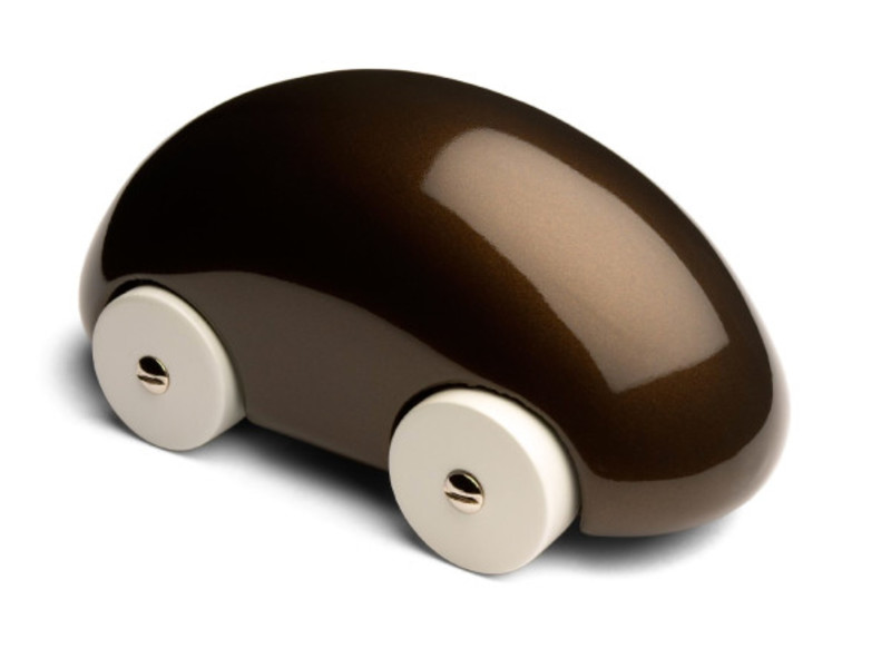
<picture> <source sizes="(min-width: 800px) 800px, 100vw" srcset=" https://images.ctfassets.net/yadj1kx9rmg0/wtrHxeu3zEoEce2MokCSi/cf6f68efdcf625fdc060607df0f3baef/quwowooybuqbl6ntboz3.jpg?w=640&h=480&fm=avif&fit=fill 640w, https://images.ctfassets.net/yadj1kx9rmg0/wtrHxeu3zEoEce2MokCSi/cf6f68efdcf625fdc060607df0f3baef/quwowooybuqbl6ntboz3.jpg?w=750&h=563&fm=avif&fit=fill 750w, https://images.ctfassets.net/yadj1kx9rmg0/wtrHxeu3zEoEce2MokCSi/cf6f68efdcf625fdc060607df0f3baef/quwowooybuqbl6ntboz3.jpg?w=800&h=600&fm=avif&fit=fill 800w, https://images.ctfassets.net/yadj1kx9rmg0/wtrHxeu3zEoEce2MokCSi/cf6f68efdcf625fdc060607df0f3baef/quwowooybuqbl6ntboz3.jpg?w=828&h=621&fm=avif&fit=fill 828w, https://images.ctfassets.net/yadj1kx9rmg0/wtrHxeu3zEoEce2MokCSi/cf6f68efdcf625fdc060607df0f3baef/quwowooybuqbl6ntboz3.jpg?w=960&h=720&fm=avif&fit=fill 960w, https://images.ctfassets.net/yadj1kx9rmg0/wtrHxeu3zEoEce2MokCSi/cf6f68efdcf625fdc060607df0f3baef/quwowooybuqbl6ntboz3.jpg?w=1080&h=810&fm=avif&fit=fill 1080w, https://images.ctfassets.net/yadj1kx9rmg0/wtrHxeu3zEoEce2MokCSi/cf6f68efdcf625fdc060607df0f3baef/quwowooybuqbl6ntboz3.jpg?w=1280&h=960&fm=avif&fit=fill 1280w, https://images.ctfassets.net/yadj1kx9rmg0/wtrHxeu3zEoEce2MokCSi/cf6f68efdcf625fdc060607df0f3baef/quwowooybuqbl6ntboz3.jpg?w=1600&h=1200&fm=avif&fit=fill 1600w " type="image/avif" /> <source sizes="(min-width: 800px) 800px, 100vw" srcset=" https://images.ctfassets.net/yadj1kx9rmg0/wtrHxeu3zEoEce2MokCSi/cf6f68efdcf625fdc060607df0f3baef/quwowooybuqbl6ntboz3.jpg?w=640&h=480&fm=webp&fit=fill 640w, https://images.ctfassets.net/yadj1kx9rmg0/wtrHxeu3zEoEce2MokCSi/cf6f68efdcf625fdc060607df0f3baef/quwowooybuqbl6ntboz3.jpg?w=750&h=563&fm=webp&fit=fill 750w, https://images.ctfassets.net/yadj1kx9rmg0/wtrHxeu3zEoEce2MokCSi/cf6f68efdcf625fdc060607df0f3baef/quwowooybuqbl6ntboz3.jpg?w=800&h=600&fm=webp&fit=fill 800w, https://images.ctfassets.net/yadj1kx9rmg0/wtrHxeu3zEoEce2MokCSi/cf6f68efdcf625fdc060607df0f3baef/quwowooybuqbl6ntboz3.jpg?w=828&h=621&fm=webp&fit=fill 828w, https://images.ctfassets.net/yadj1kx9rmg0/wtrHxeu3zEoEce2MokCSi/cf6f68efdcf625fdc060607df0f3baef/quwowooybuqbl6ntboz3.jpg?w=960&h=720&fm=webp&fit=fill 960w, https://images.ctfassets.net/yadj1kx9rmg0/wtrHxeu3zEoEce2MokCSi/cf6f68efdcf625fdc060607df0f3baef/quwowooybuqbl6ntboz3.jpg?w=1080&h=810&fm=webp&fit=fill 1080w, https://images.ctfassets.net/yadj1kx9rmg0/wtrHxeu3zEoEce2MokCSi/cf6f68efdcf625fdc060607df0f3baef/quwowooybuqbl6ntboz3.jpg?w=1280&h=960&fm=webp&fit=fill 1280w, https://images.ctfassets.net/yadj1kx9rmg0/wtrHxeu3zEoEce2MokCSi/cf6f68efdcf625fdc060607df0f3baef/quwowooybuqbl6ntboz3.jpg?w=1600&h=1200&fm=webp&fit=fill 1600w " type="image/webp" /> <img alt="Toy" loading="lazy" decoding="async" sizes="(min-width: 800px) 800px, 100vw" style="object-fit:cover;max-width:800px;max-height:600px;aspect-ratio:1.3333333333333333;width:100%" srcset=" https://images.ctfassets.net/yadj1kx9rmg0/wtrHxeu3zEoEce2MokCSi/cf6f68efdcf625fdc060607df0f3baef/quwowooybuqbl6ntboz3.jpg?w=640&h=480&fit=fill 640w, https://images.ctfassets.net/yadj1kx9rmg0/wtrHxeu3zEoEce2MokCSi/cf6f68efdcf625fdc060607df0f3baef/quwowooybuqbl6ntboz3.jpg?w=750&h=563&fit=fill 750w, https://images.ctfassets.net/yadj1kx9rmg0/wtrHxeu3zEoEce2MokCSi/cf6f68efdcf625fdc060607df0f3baef/quwowooybuqbl6ntboz3.jpg?w=800&h=600&fit=fill 800w, https://images.ctfassets.net/yadj1kx9rmg0/wtrHxeu3zEoEce2MokCSi/cf6f68efdcf625fdc060607df0f3baef/quwowooybuqbl6ntboz3.jpg?w=828&h=621&fit=fill 828w, https://images.ctfassets.net/yadj1kx9rmg0/wtrHxeu3zEoEce2MokCSi/cf6f68efdcf625fdc060607df0f3baef/quwowooybuqbl6ntboz3.jpg?w=960&h=720&fit=fill 960w, https://images.ctfassets.net/yadj1kx9rmg0/wtrHxeu3zEoEce2MokCSi/cf6f68efdcf625fdc060607df0f3baef/quwowooybuqbl6ntboz3.jpg?w=1080&h=810&fit=fill 1080w, https://images.ctfassets.net/yadj1kx9rmg0/wtrHxeu3zEoEce2MokCSi/cf6f68efdcf625fdc060607df0f3baef/quwowooybuqbl6ntboz3.jpg?w=1280&h=960&fit=fill 1280w, https://images.ctfassets.net/yadj1kx9rmg0/wtrHxeu3zEoEce2MokCSi/cf6f68efdcf625fdc060607df0f3baef/quwowooybuqbl6ntboz3.jpg?w=1600&h=1200&fit=fill 1600w " src="https://images.ctfassets.net/yadj1kx9rmg0/wtrHxeu3zEoEce2MokCSi/cf6f68efdcf625fdc060607df0f3baef/quwowooybuqbl6ntboz3.jpg?w=800&h=600&fit=fill" /></picture>Remember: you don’t need this for most hosts, just for ones that don’t support content negotiation.
Try it out
This is just a taste of the things you can do with the <picture> tag in Unpic.
You can combine media queries to give all kinds of combination.
Try it out - it almost certainly supports your
favourite frontend framework. Note that at time of writing, <picture> in Unpic
is in beta and does not support web component frameworks (Lit and WebC).